The shots below are two more side by side shots to demonstrate the difference the Rembrandt card makes.
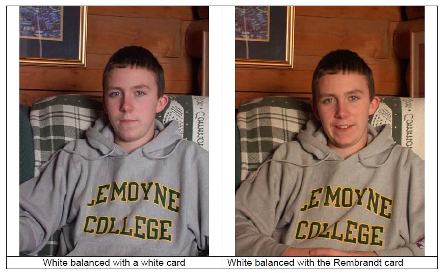
Left: White balanced with a white card. Right: White balanced with the Rembrandt card
Use our blue card to make your sunsets even better. When shooting sunrises or sunsets, it’s easy to make a good shot. But to make it look even better, white balance on our blue Rembrandt card and your shot will have a warmer “orange-yellow” look.
Our Rembrandt card works great for white balancing digital still cameras too. However, our card can only be used with a digital still camera which can perform a manual white balance. But in still photographs it may be just as easy to manipulate the colors later in PhotoShop. Of course you can do the same thing in video with sophisticated non-linear edit systems such as Final Cut Pro, Sony Vegas, Adobe Premiere, Avid, and Adobe After Effects and others, but video, of course, has so many more frames to render than there are in still photography that it is generally a lot easier to manipulate the colors during shooting.
Matching Multiple Cameras
On a multi-camera shoot, you could perform a manual white balance by all cameras on the same card at the same time, but this may not perfectly match the cameras. On studio shoots, multi-camera matching is done by an engineer with a RCU (Remote Control Unit). The cameras can then be matched or painted so their shots will intercut nicely whether it is a live switch or recorded to tape to be edited later.
Fluorescent Lights
In the old days most of fluorescent lights were the standard Cool White type which would photograph green and possibly flicker if your camera was set for Tungsten. It was difficult to remove the green cast created by fluorescent lighting. Today the technology has advanced so much that fluorescent lights are widely used for video and film lighting. They produce very soft light with little of no shadow. They require much less electricity than tungsten lights and create very little heat.
Now you can easily and inexpensively change fluorescent tubes to 3200K or 5600K degrees Kelvin (tungsten or daylight). So now you don’t have to use color correction gels.

As you can see the flesh tones look pretty good. In a supermarket like this one, you will find a variety of different fluorescent lights. Some will be around 3200K and others will be in the 5000K range. Here’s a couple more shots from the same supermarket.
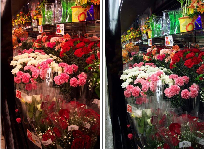
In the first flower shot I also used the same Present Tungsten white balance as I did in the previous checkout counter shot and as you can see that was the wrong choice. In the second shot I did a manual white balance. This just demonstrates that in a place like a supermarket, you will find that not all fluorescents are necessarily the same color temperature. So when you’re shooting in a supermarket, you should probably do a new white balance anytime you think the lights are different. Had I guessed at the types of fluorescents in these two different scenes, I would have been quite wrong. With a little detective work you can find out the approximate color temperature of the main lighting. So if you wanted to bring your own light as a soft key light, you could use the right gels to correct your light to the fluorescents.
This outdoor shot has at least a couple different color temperatures.

The foreground of this shot is blue up to the red barges. The sun was setting behind us so all of the foreground is in shadow caused by the mountain directly behind us (not visible from this view). As the sun goes lower the shadow of that unseen mountain will cast its shadow over the tug boat with barges and then over the mountain that is still fully lit by direct sun. The white balance of this shot was done automatically and it did capture that warm golden light that often occurs at sunset. Automatic white balance, however, can easily produce something you did not intend.

The auto white balance in the shot above removed that golden warm light that makes sunsets so special.
White balance is just one of the many tools available to control color in an artful manner. In the world of commercials and feature films this use of color is just one of the tools of the Production Designer.
Production design is the “look” of the production. It is the tangible interpretation of the visual concept of the story. More specifically, production design is the script made real by the choice of prop, architecture or color scheme. Production design at its best is a complement to the progression of the story. It correlates the visual artifacts on set with the portrayal of the story, providing the audience with an evocative, referential background for the characters. Good production design should draw the audience in, encouraging an emotional, empathetic response to the characters on screen.
Production design is the artistic elaboration of the narrative story, but it is also a practical art. Production design reconciles the functional requirements and obstacles of production with the aesthetic intentions of the director. It includes every visual aspect and practical design element of the set: color schemes, props, costumes, art direction, makeup, stage and set design. Different kinds of expertise are needed but there is one goal; to achieve an articulated, accurate rendering of the design plan.
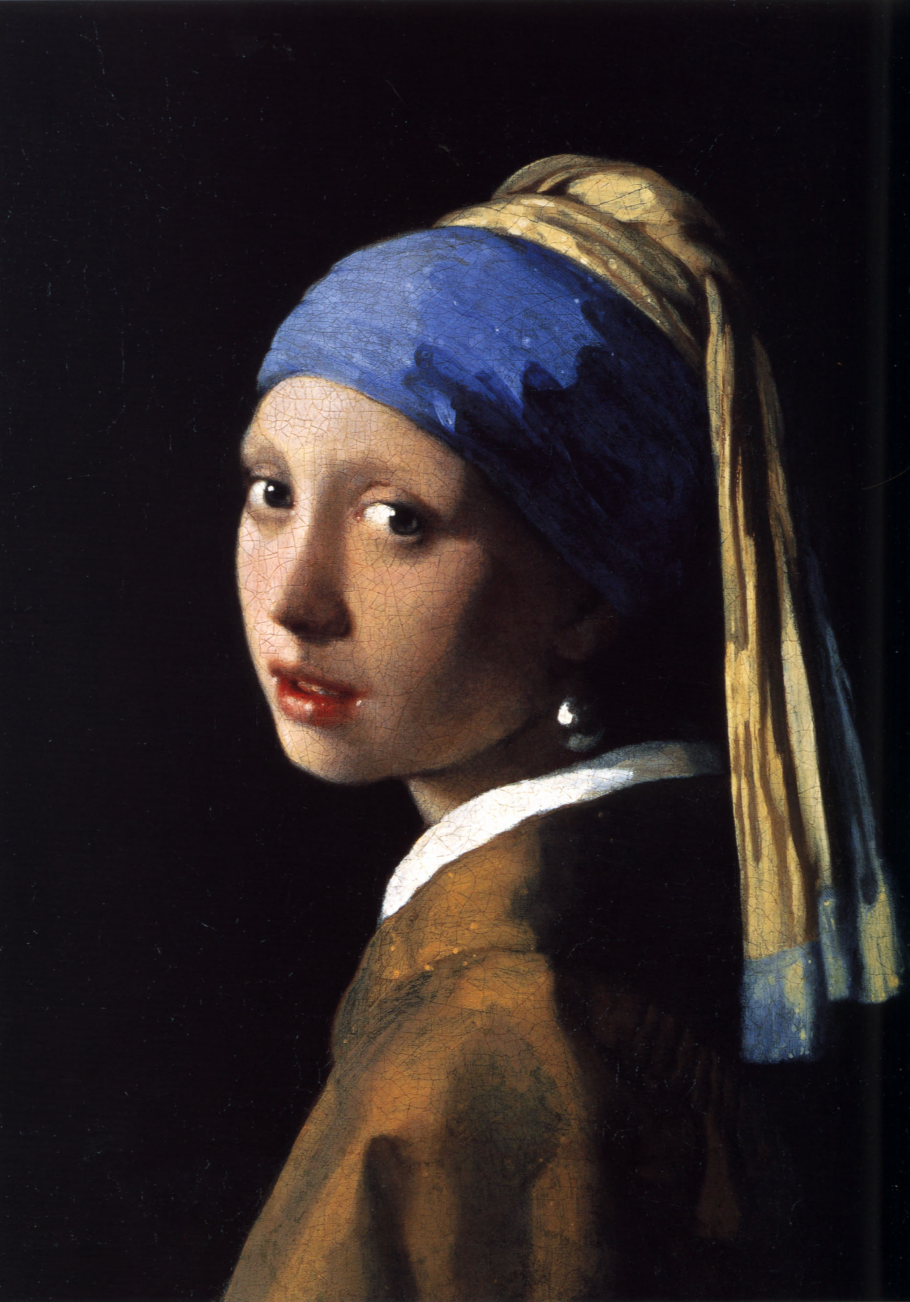
The Film Girl With the Pearl Earring from the painting with the same name was nominated for Academy Awards for
Best Art Direction and for Best Cinematography.
Certain films are famous for the quality of their design — the way in which the set and art direction represent different elements of the story. Think about films like “2001: A Space Odyssey” (Kubrick, 1968), “Gone with the Wind” (Fleming, 1939) or “Girl With The Pearl Earring” (Peter Webber, 2003). The visual design of these films reaches out to the audience. It creates a vivid portrayal of a particular time and place that is accessible and evocative for the spectator.
On smaller productions the work of the production designer is done by the director and cinematographer or Director of Photography (DP). The DP always works closely with the director, coordinating the director’s desired look and presentation of the story with the primary technical tools and equipment of the craft: camera, lights and film stock. Collaborating with the director, the DP organizes the shots and shot sequences, determining the type of lighting needed and the creation of a visual mood. The DP must take into account the source and quality of the light, the color of the set and costume, the skin tone and makeup of the performer. The DP chooses which lights to use and which placement of those lights will create the image desired: day, night, shadow, visual depth and scene focus.
The cinematographer or DP coordinates closely with the gaffer (head electrician) and camera operator to meet the needs of the picture. Establishing a shot is often a painstaking and time-consuming process. It requires a responsible approach to electrical engineering and safety.
Some of the tools of the trade include filters on the lens and filters on the lights. Filters on the lens can be used to control color of the shot. Lens filters create an effect very much like what you get using our Rembrandt card. There are advantage and disadvantages to each approach and these are some of the choices. These are some of the creative choices you can choose to make. In addition to changing colors, a lens filters can also affect contrast, sharpness, highlight flare and more.

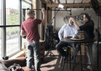

What if I’m shooting with my subject in the shade and bright sunlight in background? If I light my subject, should I match the background temp? Or can I use a warmer temp to warm the subject up?
I would want to set the color temperature for the light falling on the face. Let the background go a little warm. It will look fine.
I set the lights to be warm. Having trouble correcting now.
Are you white balancing under the lights?
The shade will tend to be bluer than sunlight so you might add some blue to your lights. Then white balance under those lights. That should make the face look right.
There are a number of ways to paint this picture. That’s just one, but white balancing under the lights you use is a essential step for any approach.